The difference between high quality professional graphics and AI "art"
Conceptually a lot of these look good. but their rendering leaves something to be desired. Typically you get weird artifacts, and the shapes don't actually make sense. It's like like a fever dream 😵💫

Don't get me wrong, I'm not anti-AI even. They're good starting points but the don't look great when printed and blown up to 5ft+ wide. This is also supposed to represent your business, it's your first impression, it says something about you product.
Here's a good example here:
On the left you have the AI generated image and on the Right you have a remake, at first glance they're similar, but play spot the difference with me. (I circled some stuff in the video)
the fries on the left are weird and blobby, the hands don't make any sense, the crown has seen some sh*t(maybe a revolution lol) the carton front is not symmetrical, there are some weird blobs in the background that make a mess and would make the decal complicated.
I remade the whole thing and took some creative liberties ( I am an artist after all 🧑🏽🎨) crown is shinier and the text is larger (to fit the truck better) and I changed the flag to be more French inspired.
But I didn't JUST fix it, I remade the whole thing as a multi layer vector file. There are NO pixels you can print this 100ft and it would look perfect. All the color shading is done with math, so that doesn't use pixels either. You could even animate this because each element is layered and you can break the image apart, modify it and more (this is how Bluey is animated)
Anyway, this was a lot of fun to make, thanks for coming to my TED talk. Let me know if you want more hyper-critical art rants 😂 to help your business look good.
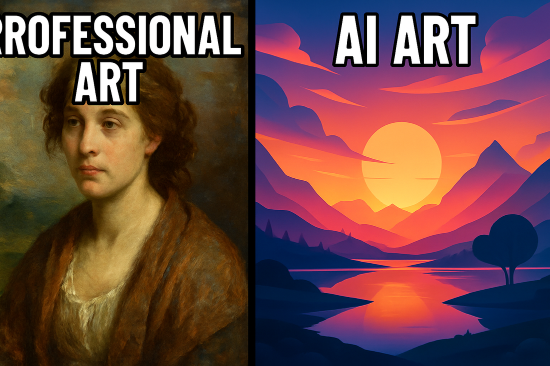
P.S. the title image of this post is AI generated as a joke, and the text is cut-off and It's ironic 😂